
Participant Observations
Introduction
Sometimes when you observe someone interacting with your product or service it results in invaluable insights. To collect opinions about the current EBP, I carried out a participant observation. I let the participants try to configure a car and let them think out loud while doing it. In this way, it became directly clear what was on their minds.
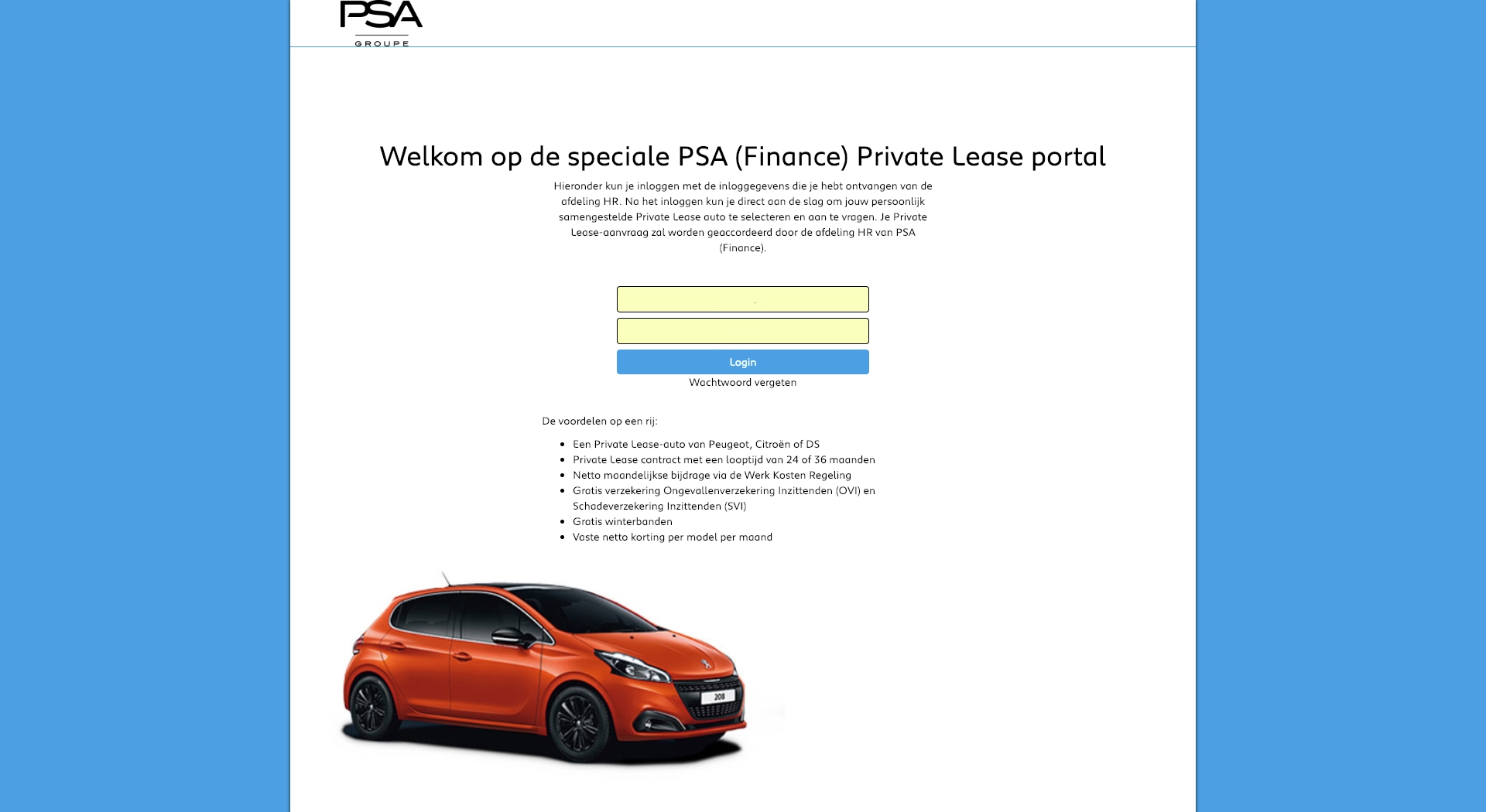
Log in
User #1
The participant was confused about the login form. During the observation, the participant needed log in data, which I provided. Only, the login name, was not an email address and the placeholder of that input field specifically asked for an email address. The participant also noticed that the login page provided a lot of text, which in the participant’s opinion were unnecessary.
User #2
The participant easily made way through a login system. The second user also mentioned the text that did not make sense.
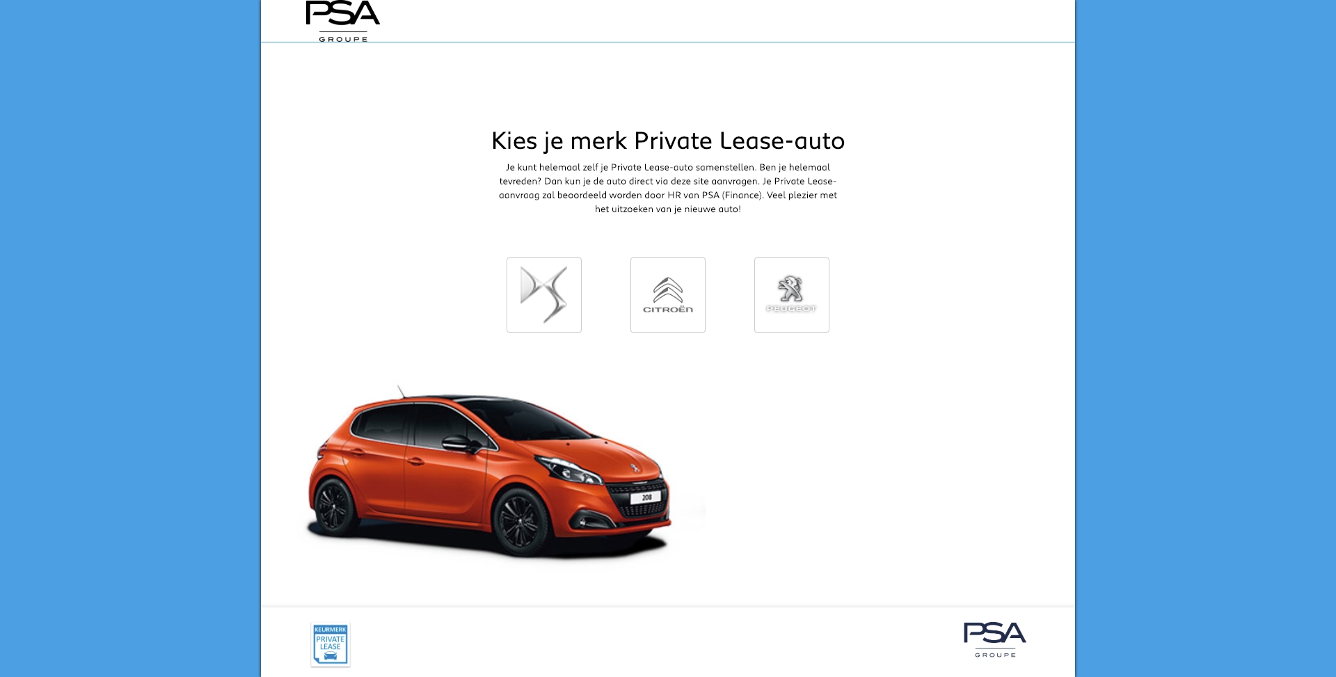
Brand option
User #1
The header text, again, did not add any value. The brand options were the main topic on this page, so the participant suggested that it should focus on that. The participant also suggested that a type of walkthrough would be helpful. In this way, a user could be guided through the process in a playful manner.
User #2
The participant quickly navigated through the different brands to see all the models. The participant suggested that it would be the user's favour to have all the models on a single page because it would take fewer clicks and it could be easier to compare.
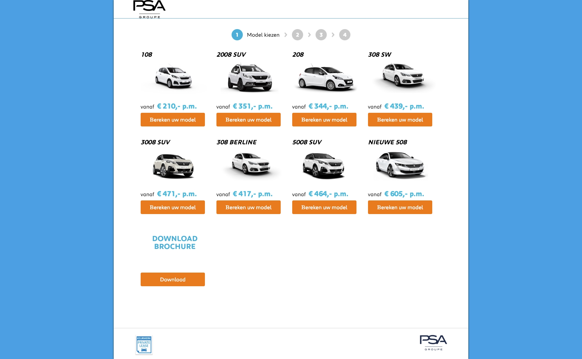
Model overview
User #1
The participant was looking for a way to filter to certain models. Also, the participant was confused about the pricing of the cars. The participant could not find out if the price included a discount or not. Lastly, the participant suggested a quick view of the car’s emissions.
User #2
N.A.
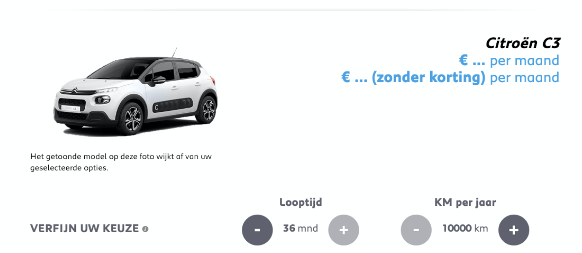
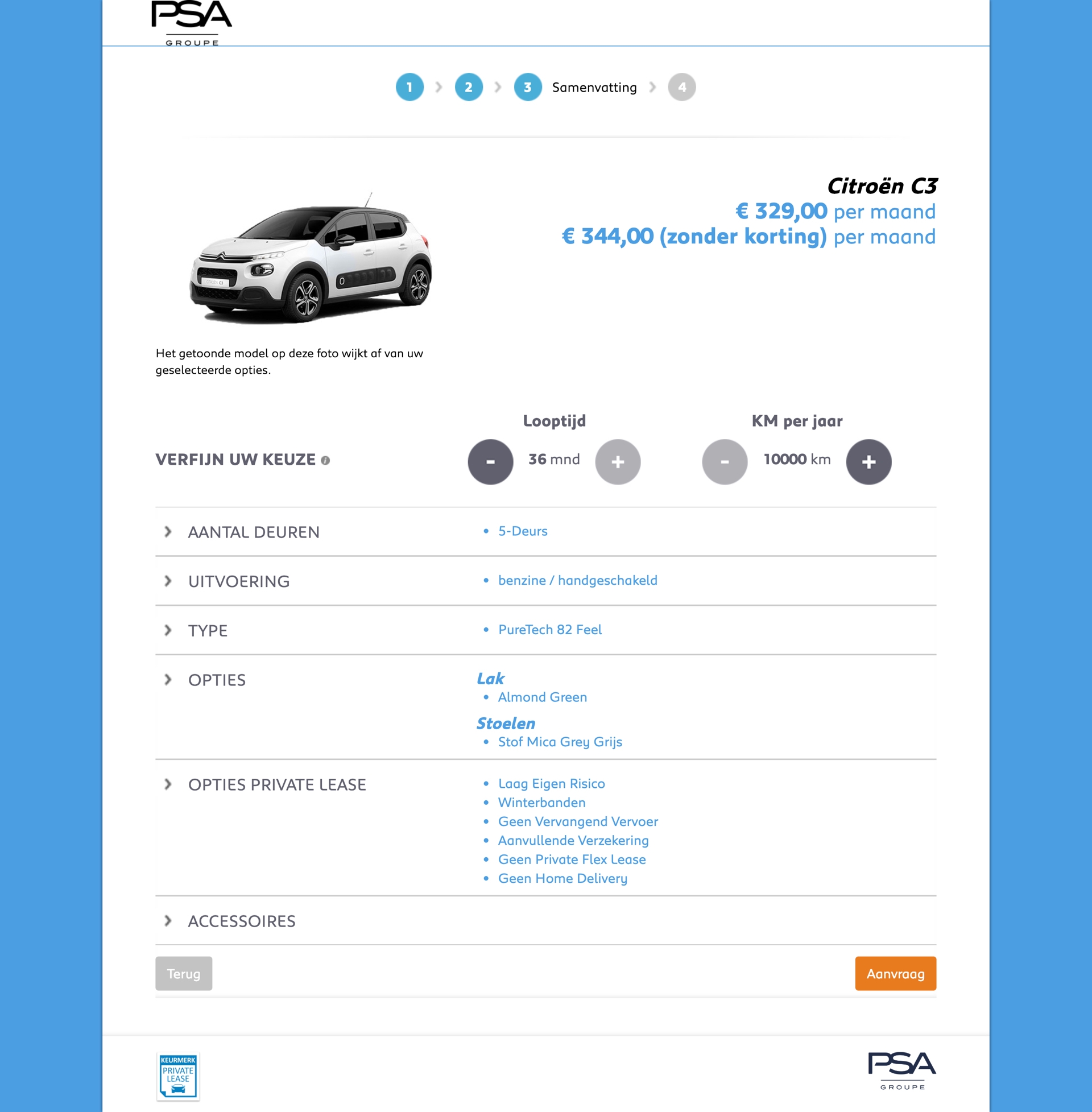
Configuration - Price indication
User #1
Because the buttons were big and easy to use (quick response), the participant was satisfied with the price indication. However, because of the presentation of two prices, one with discount and one without, the participant was oddly confused.
User #2
The flexibility in the price indication worked really well but changes the duration or mileage did not change the price. This was very confusing for the participant. In addition, the amount of discount was not presented which led to mental calculation.
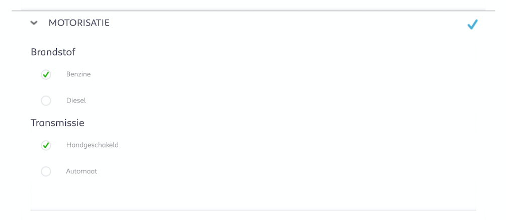
Configuration - Motorisation
User #1
The participant was surprised about the buttons defaults. The participant chooses, for example, in first place for the gasoline option which led to a car that only could have a manual transmission. Whenever the choice was changed from gasoline to diesel, the defaults changed with it. The participant suggested to better classify the default options for better usability.
User #2
The motorisation contained no electric option! The participant was really curious why there was not an option electric. Also, the motorisation did not do anything about the price.
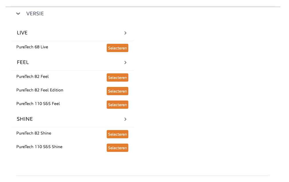
Configuration - Version option
User #1
The participant had no clue what the version option included. The first thing that came to mind, when reading the version titles, was the option of the car interface. The participant suggested that the word version could better be changed into a variant. Next, the version option could only be selected through a dropdown menu, even if there is only one option. The participant suggested to leave out the dropdown and set up clear defaults. When the participant chose a version, the participant noticed that the motorisation actually performed as a filter option. This should be a specific mode on a single page because it is an essential part of the process. Also, the price indication of the versions is not presented, the participant was surprised when the car prices rose significantly.
User #2
The version titles did not make a sense to the participant. The start amount lacked as a whole, which made the decision really difficult.
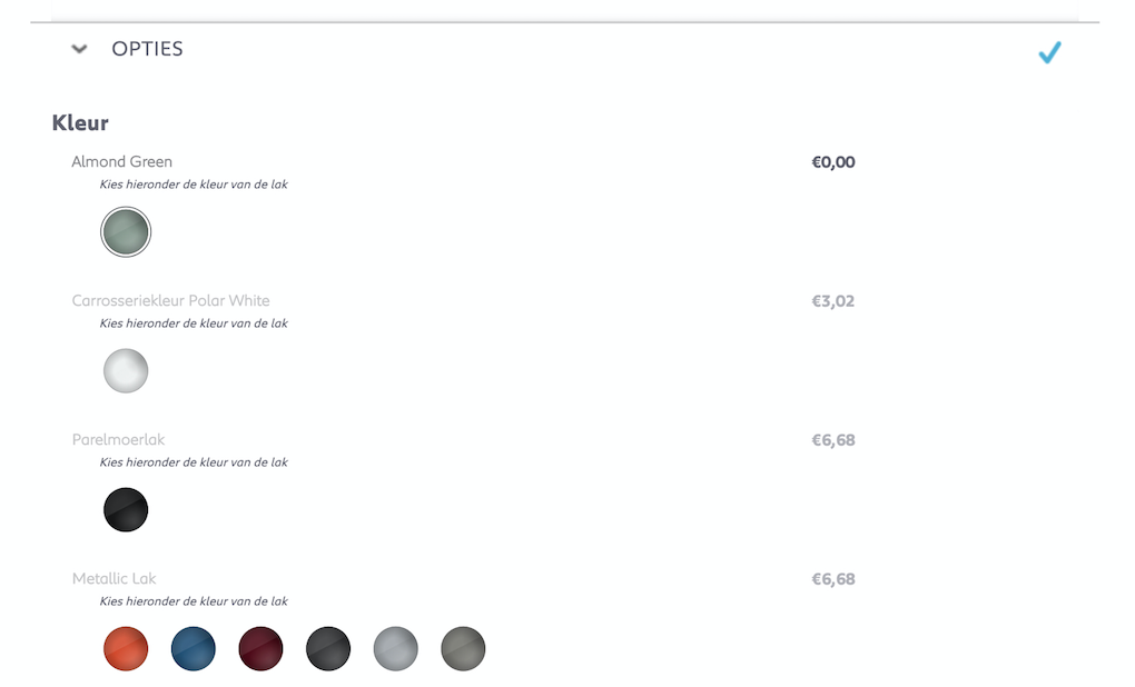
Configuration - Color option
User #1
The names of the colour did not make any sense to the participant. Since the colour of the car did not change when the participant picked a colour, the participant could not trust the definite look. Also, the colours were not divided into logical categories.
User #2
Emphatically, the participant indicated that the car was not changing when the participant picked a colour
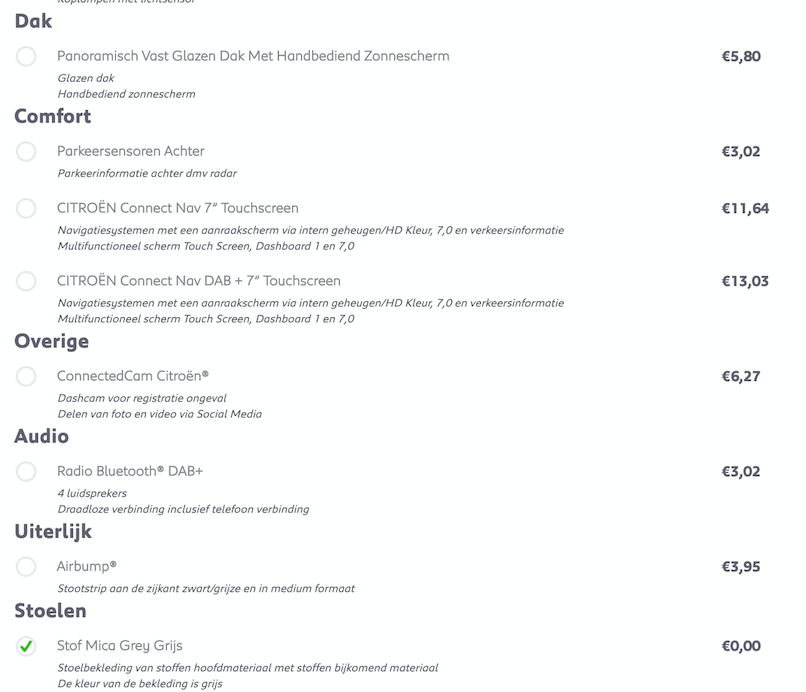
Configuration - Additional option
User #1
In the first place, all the options were written down, but there were no visual clues. E.G. a chair with all kinds of descriptions including difficult words said nothing to the participant’s mind. Also, the divisions were vague because chair-type and seat heating were in the same division. Which meant a functionality and an option were combined. As a piece of advice, the participant suggested adding a possibility to learn more about all the option, by means of a live chat or a guide.
User #2
The participant was totally lost while choosing options. The second participant also mentioned the strange titles and combination of functionalities and options in the same division.
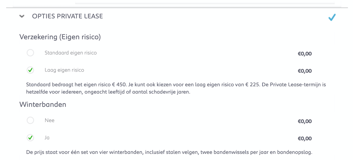
Configuration - Lease Contract Options
User #1
The participant recommended there was an overload of information which confused the participant. The explanations were below the titles and options, the participant suggested to place it below the titles.
User #2
The participant specifically mentioned the requirements of the risk of the contract. E.g. the differences between gasoline and diesel in combination with insurances. Something that the participant noticed, was a monthly payment for onetime home delivery.
Summary
User #1
The participant enjoyed the possibility to adjust duration and mileage, still at the summary. However, the participant could not go back to a certain step of the process to make adjustments.
User #2
N.a.
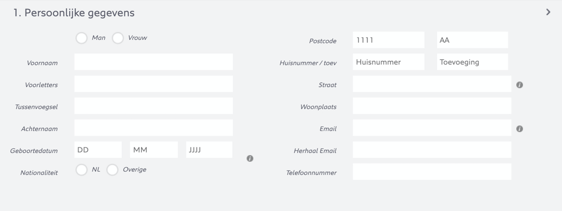
Contact form - Personal data
User #1
The form had excellent validation (states) with clear error messages. The tabs worked smoothly and fast. The participant got stuck when the email addresses were not similar due to capital letters, this should not be a problem according to the participant.
User #2
In the first place, the participant mentioned using autofill for contact forms. Besides that, the participant was delighted by the workflow of the contact form. The error messages where clear, but the naming could be improved.
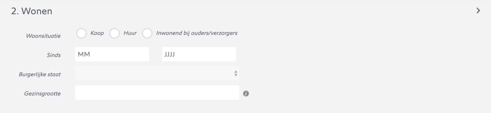
Contact form - Residential data
User #1
Stating the family size was slightly vague for the participant, because the participant had roommates and that were not direct family members the participants lived with. Also, to state the situation, the participant had to fill in a number in a text field, the participant suggested to do this differently.
User #2
Stating the family size was quite confusing for the second participant as well, since the participant had to fill in a text field instead of choosing for a number.
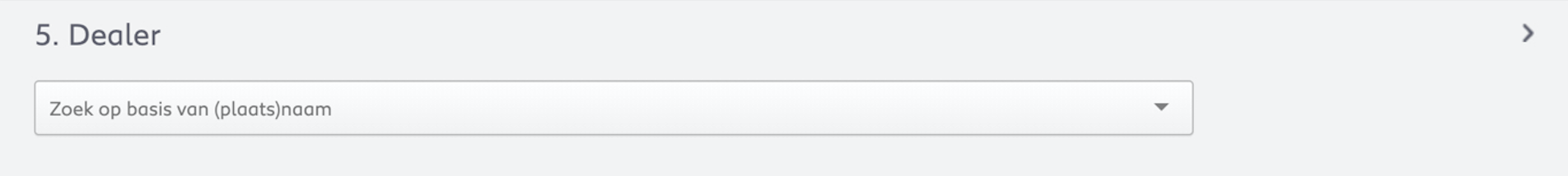
Contact form - Dealer option
User #1
The participant was looking for a minimap to search for the nearest dealer. The participant could not conclude which dealer where the nearest just by an address.
User #2
N.A.
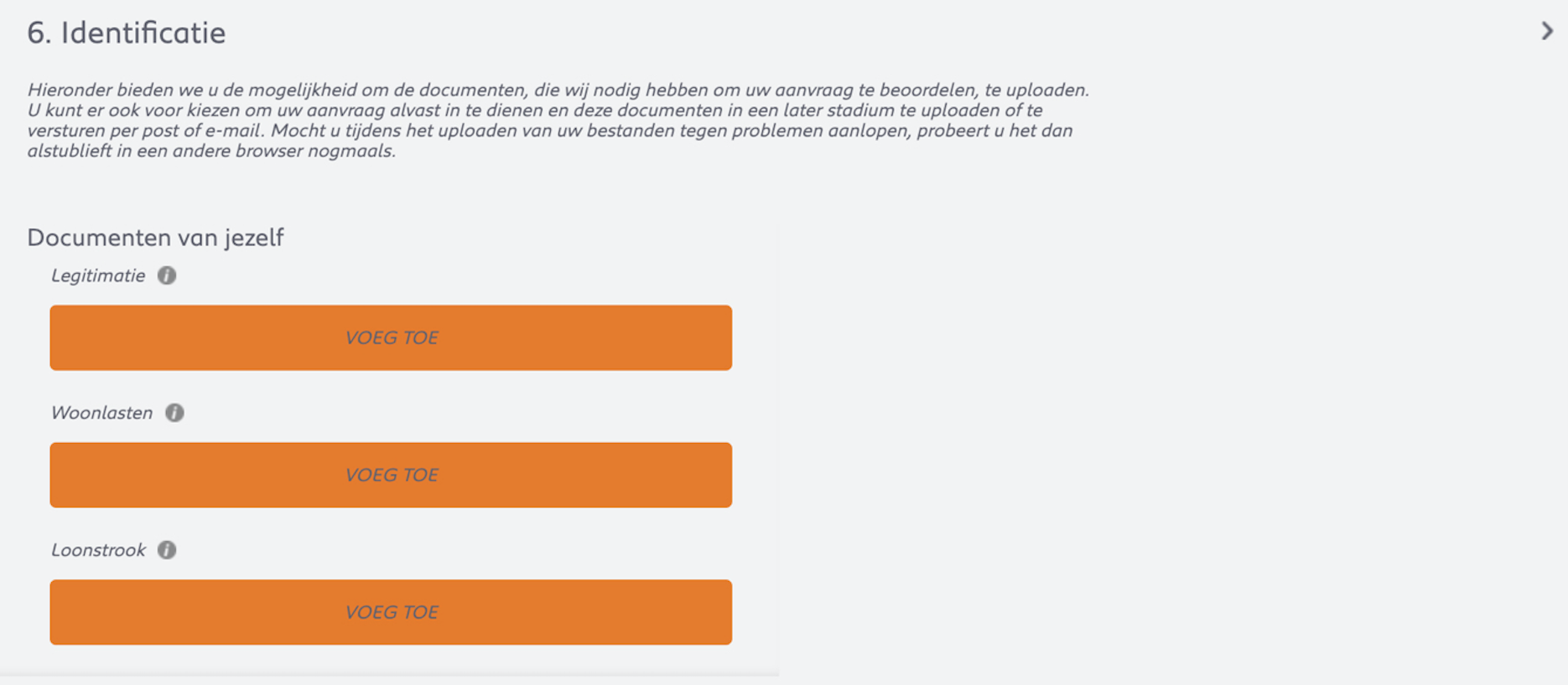
Contact form - Personal documents
User #1
The participant would have liked previews of what was uploaded. The participant noticed that to continue, the participant had to agree with terms he did not want.
User #2
N.A.
Tips and remarks
User #1
The text below the mentioned car can be confusing for users (product page)
The tooltips are really small
How does your contract with your employer work in combination with a lease contract?
How is the discount calculated? I want to see the amount of discount at all time.
Reorganize the options to make it more clear what they include
Make clear that motorisation options are actually filters, or provide a walkthrough
Remove unnecessary copies
When filling in the contact form, provide validation per section
User #2
When receiving a thank you mail I want have images, gifs, videos, reviews, ratings, information about safeties and about insurances
Also, I want to have an option to print my request at the end of the signing process
The thank you page copy lacked any form of trust
Add contact data to ask questions about a uncertainties
Last updated